Posts Tagged ‘Orange County’
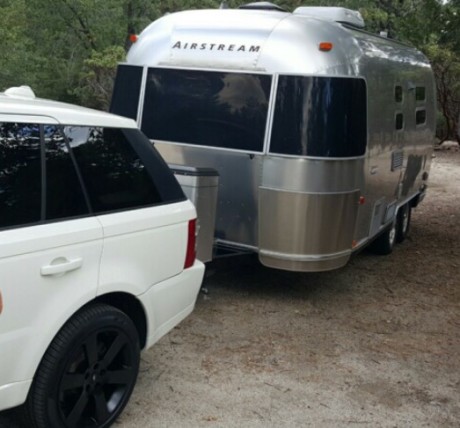
I love nature and being outdoors. Growing up in Utah I spent many family vacations in the mountains and on my parents boat at Lake Powell. I guess that’s where it all started and now I’m going back to my roots and my love of nature. Don’t get me wrong, I love living at the beach in Newport. The weather in Southern California year round allows me to spend most of the year doing outdoor activities. However, it’s another thing in California to get away from traffic and people to just be alone with nature. Solitude and quiet time restores my spirit and stimulates my mind and creativity. So in my quest to get more of this, I thought an Airstream would allow me to get away and escape the hustle and bustle of my everyday life.
Airstream trailers are a classic and were started by Wally Byam in 1929. I’ve always loved the sleek look of Airstream travel trailers. So I decided to get the 23″ International CCD. The original interior design was ultra modern, sterile and very stark. To me, modern and camping just don’t go together. I wanted to create a rustic interior design for my weekend road trips so I started looking for materials that would warm up the space and make it more like a cabin.
A Little History on Airstreams
In 1931, Airstream history began with Wally Byam’s dream: to build a travel trailer that would move like a stream of air, be light enough to be towed by a car, and create first-class accommodations anywhere.
Every inch of an Airstream has a function. They are the most thoroughly tested brand in trailer history. Its engineering is the culmination of over 80 years of experience plus millions of miles on roads throughout the world.
With Airstream travel trailers, there is no planned obsolescence. Airstreams of the Thirties are still on the road today, sturdy and modern as ever. They are intended as a lifetime investment in happiness.
Let the Renovation Begin
Here are some of the highlights of my renovation that I thought would be fun to share with you all and show you some before and after photos. If you are looking to do your own Airstream renovation, hopefully this will give you some inspiration to start.
I kept the original floor plan due to the expense of rerouting electrical and plumbing. So after tearing everything out, the only thing remaining was the bathroom. I didn’t do any remodel to the inside of the bathroom. Below is the photo of what it looked like after everything was taken out.
I knew I wanted reclaimed wood floors and that was where my inspiration began. In the wood that I found, there was a pale blue gray, so I decided to use varying shades of blues in my design.
Below is a photo of the wood and the materials that were inspired from these floors.
Countertops
I love the look of cement countertops, but when designing any trailer, I had to be conscious of weight, so rather than use real concrete, I opted for a laminate that looked like concrete. I loved the lighter and darker shades in this laminate and it looked so realistic.
Cabinet Laminate
To contrast the lighter countertops I chose a charcoal gray wire brushed oak laminate for the cabinets. The original samples I had selected were too busy with the floors.
Dinette Area
I had the dinette booth made and used a blue gray ultra suede fabric for the seats and seat backs and then contrasted the back with a medium brown leather.
Bathroom
The bathroom laminate was originally a stark white and it just didn’t complement the warm colors I was using, so I chose a wall covering from Phillip Jeffries to cover it. It created texture and warmth to the space.
Window Treatments
The original window treatment material that I selected above looked great and had a bit of blue that I liked, however, they were too thick and wouldn’t work as a roller shade, so I had to go with a grass woven material that would roll up tightly in the recessed areas in the overhead cabinets. Be careful when selecting roller shade material to make sure that they will roll up properly in a small space.
Bedroom Area
In the bedroom area I chose a natural linen for the drapery panels. I used my accent blue gray on the sheets and blankets and a decorative pillow with a pattern that encompassed all the colors which added a bit of interest to the bed.
Accessories
The accessories really finished the design by adding pops of color and texture. I purchased rustic melamine dishware from Williams-Sonoma since I didn’t want anything that was breakable. Rustic bark textured silverware, vinyl grass woven placemats, a pale blue ultra suede desk chair and a blue lamp with a natural linen shade. And finally some artificial succulents that added a bit of color and life to the countertops.
This airstream renovation took as long as some homes I’ve designed…almost a year! There were many challenges working in a small space with weight specifications and other obstacles, but in the end I’m very happy with the results.
Are you looking to start your own renovation? Give us a call and we will advise and help you renovate and create the look you want for your Airstream.
If you’re interested in renting out my Airstream and are in the Southern California area or want to visit and do a road trip up the California coast, follow the link below to book your reservation on Outdoorsy.
Have you just renovated your Airstream? Share your story and post photos in the comments section below. We would love to see what you have been up to and would also like to get your feedback on some of the challenges and advice for others who are just starting their own renovation.
Looking for a Brownstone Furniture Dealer in Orange County?
We are proud to announce Christopher James Interiors is now a dealer of Brownstone Furniture in Orange County. We love this collection of furniture and the diverse styles that are offered, from modern and transitional, to rustic and classic. We think you’ll like it too! Here are some of our favorite pieces from the collection…
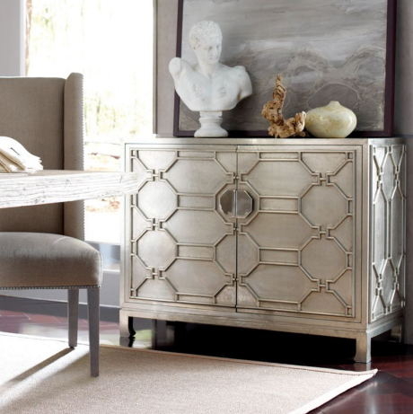
Treviso Two-Door Accent Chest
This chest makes such a great statement! It makes for a beautiful entry piece. This chest looks like it’s painted silver, however, it’s actually crafted out of German silver. This is not a finish, but an actual cladding of metal, meticulously nailed to the surface of the piece.
We recently used the Treviso two-door accent chest from Brownstone Furniture in a bedroom design and used them as nightstands along side the Palmer Canopy Bed in the driftwood finish. The pale pink grass wall covering is from Phillip Jeffries.
Atherton Onyx Bed
This bed is another one of our favorites. It has a transitional look, allowing you to mix it with modern and traditional furniture. The headboard is upholstered in a washed burlap and also comes in a lighter teak finish. The benches at the foot of the bed are the Atherton Onyx Bench which come in a black and white chevron fabric.
Harrison Bookcase
This bookcase has such a clean, modern look. You can use several together to create a larger bookcase if you have a large wall you want to showcase books and accessories on. This bookcase comes in three different colors…chestnut brown (walnut and mahogany wood), driftwood and mink (sandblasted teak wood).
Ibiza Chair
This chair is streamlined in design, yet remains relaxed and comfortable with a natural khaki linen fabric and solid oak wood frame. It comes in two finishes, driftwood and sepia. The Ibiza chair goes great with the Atherton Teak or Saratoga Dining tables also from Brownstone.
Tangier Herringbone Accent Chest
This herringbone chest is hand crafted using buffalo bone and is truly a work of art. Another statement type piece for that special place. The bone is cream and gray and the frame is aged iron.
Marcel Cocktail Table
The Marcel table is made with solid reclaimed elm wood. The intricate pattern of the top further enhances the beauty of the reclaimed wood. This table has a modern yet rustic look and goes great in an industrial style loft or a beach house.
Marcel Chair
This classic European style slip covered chair is offered in two linen options, natural with a brown bottom border (shown above) or in a solid pewter without a bottom border.
If you are in Orange County, let us know and we can help you with any of these highlighted pieces or any items from the Brownstone collection.
Images via Brownstone
Five of the Latest and Greatest Bathroom Ideas
When it comes to interior design innovations and improvements, bathrooms very often turn out to be places where the owners pay the least attention. There is no justifiable reason for this and, luckily, the manufacturers and designers of bathroom equipment do not think alike. It seems bathrooms are becoming increasingly interesting when it comes to implementing new ideas and this is why every year there are several original and practical bathroom additions. Here are the latest ideas that even the most reserved people will find hard to pass up.
Hexagonal Tiles
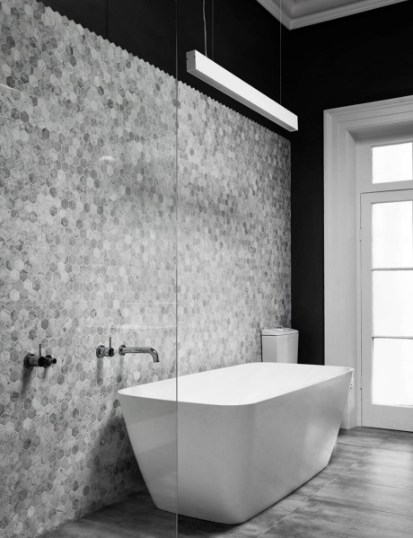
According to an Aroma Therapy article hexagonal tiles are one of the most sought after additions to the latest bathroom ideas. These traditional patterns are being perfectly implemented in contemporary design ideas, giving a sort of an old-school feeling. Eclectic interior designers simply adore their classy look and contrasting atmosphere they create. Contemporary interior designers, in general, emphasize the space deepening effect and cleanliness they add to both walls and floors. The multitude of patterns available is a plus by all means.
Open Shower Concept
The usual approach to a shower installation is a closed cabin positioned in a corner spot. Understandably, this is done out of practical and space saving reasons, but it takes away all creative design possibilities a differently placed and shaped shower would provide. A different concept is becoming increasingly popular and open showers, with only one wall separating them from the rest of the bathroom, are being more and more implemented. This will open the entire space and provide additional design possibilities, completely changing the atmosphere.
Tub and Shower Combination Bathroom Ideas
All those people who simply cannot decide whether they prefer showers or tubs and wish to have both options should definitely look into these bathroom ideas. The essence is to have a shower space right next to the bathtub. A wall to wall approach would be the best and most convenient. A single glass wall separating it from the rest of the bathroom will additionally enhance the effect. This approach makes installation of both shower and tub easier and in fact saves space, making it possible for small spaces to fit both bathing solutions. Maintenance advantages are pretty obvious.
Wood…But not Wood
Wooden floors are at the top of choices for most renowned interior designers due to the elegance and warmth it provides. Unfortunately, using wood floors in a bathroom setting is highly impractical due to humid bathroom environment. Luckily, ceramic tile technology makes it possible to create a wood look with tiles made entirely of ceramics, perfectly combining aesthetics and durability. This is one of the most prominent new design bathroom ideas.
Black, White and Gold
Color combinations play an important role in any design approach and these three colors are what is at the center of attention when it comes to the latest bathroom ideas. Black and white mixture is a well-known design combination that provides both elegance and intrigue. Enhanced by golden fixtures, mirror frames and faucets, the overall atmosphere becomes more spacious and dynamic. Classy, but different, is another way of describing this color combination and interior designers are recommending it to anyone with an artistic sensibility.
Which Idea Would You Go For?
If you have any concerns about whether your bathroom space is suitable for a particular idea or which of them would be the most appropriate design-wise, research bathroom renovators for rough works and the best interior designers on the market and feel free to ask for advice. It is always suggested to consult an expert interior designer to minimize any potential risk.
Bathroom renovation is a great opportunity to make the change for the better. Consider these bathroom ideas and you will surely find a way to implement some of them and enrich your bathroom design.
Tips for Creating a Great Home Office Design
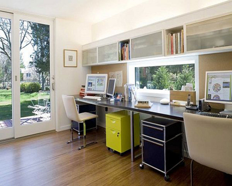
Nothing beats being your own boss and avoiding a long commute to work. This is exactly what working from home enables you to do. However, spending hours on end in a tedious environment tends to impact productivity in quite a negative manner, which is exactly what having a home office offers escape from. By doing some research and following these home office design ideas, anyone can turn a murky, sterile space into an inspiring, creative room.
Add Lighting to Your Home Office Design
Nothing is better than to infuse some life into a potentially boring world of business than some vivid lights. Working in a lively atmosphere is a well-known mood and productivity booster. Furthermore, colorful lights work benefits with regards to focus and concentration. Just make sure that there’s enough light around, so that you see clearly what you’re doing, in order to avoid potential damage to your eyesight.
Tools and Gadgets to Add to Your Home Office Design
What better way to break the tedium of a workday than making sure you have something to occupy your attention. Luckily, there is a ton of cheap gadgets available out there at your convenience. Those most popular come in forms of USB-oriented ones:
USB desk lamp – Even though functional, this tool can turn quite interesting to use, and the sheer fact that it is powered by your own computer is a fun fact to begin with.
USB lava lamp –Why not take your break in an ambient of a smooth, relaxing light to calm your mind?
USB cup warmer/cooler – Ever had to power through a cold coffee, or a warm coke during winter on account of being too busy working? Make sure you never go through this nightmare again by opting for an affordable cup warmer/cooler.
IKEA
When in doubt, always go IKEA. Quite affordable and awesome-looking, having IKEA appliances might be a great way to improve the general vibe of your home working space. Something as basic as an IKEA desk tends not only to make your home office space look classy, but also turns it functional, while paying compliments to your pocket.
Monitors Overview
Desk clutter nowadays seldom comes in the form of actual, physical clutter, but rather a virtual one. There is no better way to avoid unfortunate situations like these than opting for six side-by-side monitors instead of the mere one. Furthermore, if the cool look of a panoramic wallpaper isn’t a reason enough for you to opt for this technological miracle, the fact that it provides a significant improvement to your productivity should be more than enough. Impressive, isn’t it?
Space Management
On the note of clutter, working a desk job is impossible if you don’t utilize your space well. First of all, don’t even think about not having a dedicated room for your work. Second of all (on a much brighter note) you should know that fitting your home office into rooms as small as your closet is entirely doable. By making sure that you use the most out of your walls, you’re providing your future self with a ton of relief. Think shelves, writing implements, whatever comes to your mind – there’s more than plenty of office furniture options out there. Additionally, some decoration certainly won’t hurt.
Cable Management
These simple office appliances can turn into quite a nightmare. Trust me, you do not want to own a bundle of cables, so firmly tangled-up, you can shoot hoops with them. Follow these couple of tips and in this way make sure you keep them at bay:
First of all, keep the cables identified and separated.
Always overestimate the length – a couple of extra meters haven’t hurt anyone.
Keep an Eye out for Distractions
Sure, a certain amount of distractions can help during breaks, but you do not want trivial things giving you a reason to procrastinate. Keep things basic and in that way make sure you stay productive.
Although basic, these few home office design tips might turn out to be more than helpful. Make sure you maintain a healthy level of distractions, the furniture and appliances basic and functional and space carefully thought-through. In this way, you can rest assured that you are productive, while in the comfortable confines of your home.
Images via Houzz
Consider These Ideas When Choosing Window Treatments
Every home needs something to cover the window; no matter where your home is located you may need to look into choosing window treatments for privacy, warmth or simply aesthetics. However, there are a great many different styles available to choose from and this can make it difficult to choose the right covering. The following tips will help you decide on the right balance of function, style and affordability:
1. Function
The window treatments for each room should be based upon the use of that room. Family areas and entertainment areas will require as much light as possible. This means the window treatments should be light, semi-transparent and kept as far back from the window as possible. Some spaces may also be used to watch films or play computer games; these rooms will want less light as you do not want reflections on the TV. If this is the case then you should use a layered approach; this will mean you can adjust the light in the room depending upon what the room is used for.
2. Location, Location, Location
Choosing window treatments may not seem as important if you are in a remote location without a neighbor for several miles. However, if your home looks onto someone else’s, then the first priority when choosing window treatments in these locations is privacy. You will need a heavier, easy to open and close style window treatment to ensure you are safe from prying eyes.
Location also plays a part in the amount of sun you receive through a window. Windows which face the sun all day will likely heat up the room, light color window treatments can be used to maximize the light in the room while keeping some of the heat out. Blinds can also be good in this scenario.
3. Privacy and Style
This is an important element of any home, you will wish to enjoy a shower or change your clothes without being concerned about who is watching. Bedrooms and nurseries can benefit from heavy, black out coverings to aid with sleep and privacy. Bathrooms, however, need light coverings which will allow plenty of light into the room, without compromising your privacy.
4. Fabric
The material used when choosing window treatments makes a big difference to the amount of light or privacy which your room will receive. Thinner fabrics will allow more light in, but will also decrease the amount of privacy you have. The fabric should be chosen based upon the function of the room and how much light you require. The lighter fabrics will ensure any space feels light and airy while darker fabrics can create a more dramatic environment. Coverings with linings are also useful as they protect the furniture from harmful UV rays while adding an extra layer of insulation to a room.
5. Size
The type and size of window treatment you choose also makes a difference to the feel of the room. Curtains hung above the window and dropping to the floor will create a feeling of height in a room. However, many people now opt to keep the curtain from sitting on the floor; this avoids dust and dirt gathering on the curtain. More dramatic looks can be achieved by bunching the material in front of the window; this means ensuring your curtain is two or three times the width of your window.
6. Color
The color of a window treatment is down to your personal preference. It should match the color scheme in the room, although this does not have to be the same across the whole house. Brighter colors have been shown to assist in brightening the mood of any room; darker colors have the opposite effect…the choice is yours!
Before deciding on window treatments for your home, you should assess your options. First analyze the space you have available, measure the height and length, and go for a color combo that goes with the rest of the décor. Invest in quality materials and your home will have an appeal that you and your guests will absolutely adore. Be original and let your imagination run wild. Don’t hesitate to think outside the box and just enjoy the end result!
By Daniel Lewis and VanessaArbuthnott.co.uk!
Images via Houzz
Are You Looking to Create a Vintage Bathroom Design?
History always repeats itself and vintage bathroom design is back! We are now facing the rise in vintage-inspired decorations and rooms completely equipped in that manner. What makes vintage so characteristic now is that it looks like your grandma passed it on to you (and it’s like that in the majority of cases), which evokes sentimental feelings in almost any person.
When it comes to redecoration, bathrooms are especially tricky. Since they are usually small, you do not have so many things to do but reinvent the wheel. So, if you do not have a grandmother to provide you with necessary equipment, go straight to a flea market in search for these things which will help you turn your little bathroom into the cutest vintage-style one.
Start with Walls and Floors When Creating a Vintage Bathroom Design
The easiest way to start your vintage bathroom design is with the floors and walls. Avoid bright, dashing colours characteristic for contemporary design, and use soothing pastels and gentle white. Find wallpaper or tiles featuring floral or old advertising prints which bring about the feeling of 1920s, 30s or 40s, or some vintage movie poster that can add a distinctive and monochromatic touch to the space.
Pastoral themes are also a great way to (re)introduce an old feel in your bathroom, whereas old recruitment posters can add colour and striking effect to the style you are aiming at; just for a little fun.
Add Some Mirrors to Your Vintage Bathroom Design
Adding mirrors to your vintage bathroom design will create the illusion of it being larger than it really is. You can use this to your advantage if you add old, decorated carved frames. You can either find them separately, or use some old picture frame and repurpose them with a mirror. Frames are a great way to revive the space and even a plastic imitation will do the trick as well and achieve the effect we are aiming at
Bathrooms as we know them today did not used to be a standard part of a house – they were a completely new thing for a Victorian, for example. This is why in old houses they seem kind of off – as if they were not supposed to be there in the first place. So, if you want to achieve this effect, you will have to do some major plumbing installation movement and change the fixtures.
With the help of a commercial plumbing company, you can completely transform any type of room into a bathroom, just like the old Victorians did back in the day when bathtubs and advanced plumbing started appearing.
For example, instead of a shower, you simply have to install a clawfoot or antique tub (movable tubs were a completely normal thing, so why would your tub not be like that as well?), and a pedestal sink instead of a vanity compartment. You can never go wrong with white, distressed wood, and when it comes to fixtures – old-style works magic.
Add Accessories to Your Vintage Bathroom Design
The last thing you can use to add to your vintage bathroom design remodel is accessories. Old hairbrushes are a simple must-have; they used to be packed in old decorative containers, usually with a common theme or decoration. You can also recycle old step ladder or an old chair, repaint them into white and repurpose – use them as towel holders or hangers, for example.
If you have found an old cupboard in your grandmother’s house, you can use its nicely carved drawers as storage containers in your vintage bathroom design. If you have old teacups, you can turn them into flower pots and place them wherever you see fit.
Old houses usually had wealthy owners, so let accessories including lush bath robes, quality towels with initials, and fancy slippers – become standard items in your bathroom. And if you want to spice things up a bit, let an old, carved, wooden chair be the crown of your bathroom – which was a completely normal thing in vintage bathrooms.
Bathroom items can be tricky to work with, but as you can see, if you invest some time and devotion to them, you can do wonders with the slightest changes made. Follow your instincts and take every old item you see, give it a new look and find a place for it in your vintage bathroom design remodel.
Diana Smith is a full time mom of two beautiful girls interested in topics related to interior design and latest DIY projects. In her free time she enjoys exercising and preparing healthy meals for her family.
Images via Houzz
4 Tips to Create a Vintage Bathroom Design
Are You Looking for Some Amazing Playrooms?
Turn your child’s playroom into a wonderland through the décor choices you make. Any room or open space can easily be transformed into a kid’s perfect play place with some ingenuity and a little creativity.
Make it Safe and Bright
Via: Zillow Digs
The floor in this playroom consists of the same foam tiles that nurseries use to keep kids safe. The bright colors excite the senses, making this a fun place for kids to play in. As an added bonus, buying these tiles for your home will likely be cheaper than opting for wall-to-wall carpeting or another floor covering. Try using this flooring to create amazing playrooms.
Make it Fun
Via: Zillow Digs
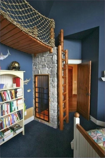
If you thought ladders and bridges were only for outdoor playgrounds, think again. Ladders and bridges make for amazing playrooms. This family has a rope bridge inside the playroom for the children. This bridge lets kids play out their imagined adventures even when they cannot go outside to a playground. What makes this room stand out is the rest of its design. Dark blue on the walls and ceiling and fish painted under the bridge give the impression of playing in an underwater kingdom. This is the perfect room for a budding little Jacques Cousteau, pretend pirate or imaginary mermaid.
Create Amazing Playrooms by Bringing the Outdoors Inside
Via: Houzz
Bring a playhouse inside your home to create an unusual place for your children. This playroom has the façade of a child-sized house with room enough inside for little ones to enjoy tea with their imaginary friends. The designer even included a child-sized picket fence and a painted tree on the wall outside the indoor playhouse.
Think Surreal
Via: Zillow Digs
It’s no secret that kids have their own crazy imaginings. Why not design their playroom with this in mind. This playroom features a racetrack that runs on the wall. It’s just the kind of wild thing that kids love. Be sure to use toys for decoration that your kids are not going to play with soon, or you may find that your wall-mounted racetrack has been pulled down by a child who wants his toy cars back.
Give Them Reign
Via: Houzz
Your home may be your castle, but in the playroom, your kids reign. This playroom takes that idea to the extreme by turning it into a castle. This kids’ castle includes a slide to exit, a dining set for royal teas and balconies for having pretend swordfights on.
Design a Fan’s Dream
Via: Zillow Digs
Children’s playrooms can cater to their love of a favorite sport or team. This football fan’s playroom features a larger-than-life football and slides along with wall murals depicting the New York Giants.
Get creative when choosing your playroom designs, and use these six amazing playrooms as inspiration for your upcoming projects. For more kids room ideas go to Modernize.
Guest Post by Jane Blanchard of Modernize
6 amazing playrooms that your kids will never want to leave
A Serious Cook and Chef Needs a Beautiful and Functional Kitchen Design
If you’re a serious cook, you know how important a well organized kitchen is, and how frustrating a kitchen can be if it isn’t! Your kitchen should be optimized for cooking, cleanup, and easy access to storage, and if it isn’t yet, here’s how.
Stoves: Electric vs. Gas
Perhaps the most important appliance in the kitchen, the stove is what brings on the heat. Electric stoves are useful, but can skyrocket your power bill and don’t heat up as quickly. A high-efficiency gas powered stove is more efficient than an electric, and can cook food more thoroughly and evenly. The placement of the stove is important – it should be within range of all the pots and pans that you might use, as well as the sink or food disposal unit, so that if something catches fire, it can be put out quickly.
Storage
So, that cute little dinosaur pancake mold you have isn’t used every single morning. Put it away, either in the very back of your cabinet, or in the basement or attic until it is needed. The space in your kitchen is in high demand; store only the pots and pans that you actually use on a daily basis in the kitchen. The same applies to spices; while you might use that obscure Russian brand of mayonnaise for that one special dish sometimes, by no means should it take up counter space. Keep the basic spices close at hand, as well as your mixing bowls, spoons, etc.
Kitchen Sinks
The single most used area of your kitchen. Many kitchens could benefit from the installation of a second sink, but if this is out of your budget, consider what you can do to free up work space around your sink. Try installing a goose-neck sprayer for easy cleaning of large pots and pans, as well as reaching all sections of your sink. Make sure that the pots and pans you use can fit inside of your sink for easy cleaning.
Countertops Are One of the Most Important Aspects of Kitchen Design
You should have plenty of free counter space in your kitchen. If at all possible, use a non-wooden counter top, or one with a glazed cover. True wooden counter tops can be nicked easily, and store pathogens and other undesirables inside the cuts. With the same logic that is applied to wooden cutting boards, wooden counter tops should be cleaned very thoroughly after use, especially when handling raw meats.
Your kitchen design needs to suit your personal preferences, but they should also be the most efficient, streamlined rooms in your home. Keeping a kitchen clean reduces stress, and makes people want to cook, which results in a chain reaction of healthy choices down the line. A well designed kitchen can result in a myriad of tasty dishes being made, so everyone wins!
Gracie Gardner is an interior designer, photographer, and writer from Tucson, Arizona. She loves talking about cooking, kitchen remodeling, and kitchen design.
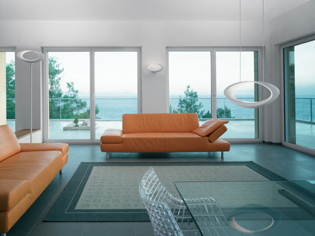
Many people do not realize how important lighting is to interior design. Decorative lighting is one of the major factors that play into the process of creating the mood of a room and creating the meaning behind what you’ve put together. If you’ve just got a plain or flat lighting, you’re more likely to make people who come into your home uncomfortable. On the other hand, decorative lighting can create the comfortable, “homey” feel that you may be seeking in your Orange County Home.
One important function of a decorative lighting scheme is variation. Using various types of lights, different light levels, and sources that seem to focus on what the room is for. For example, an interior designer may suggest that you put dimmer lights in a bedroom (because it is for sleeping), but brighter lights in a family room or play area (because it is for “fun”). Determine what each room is for before starting to work with lighting, otherwise you could end up with some odd lighting arrangements that don’t match the room’s purpose.
Chandeliers are a great option for rooms where you want the lighting source to be a focal point. The objects that are underneath chandeliers become the focal point of the room due to the way that a chandelier diffuses light. You could use a pendant for the same purpose, even though the light diffusion differs. These are just examples of what you could do in your home; any Orange County lighting store can help you determine how each type of light will change the “feel” that your room(s) have.
You can use lighting to create these different moods in miscellaneous ways. Be creative, and see what you come up with while you’re decorating your home. You can find a variety of different lights that will suit your lighting needs at any Orange County furniture store.
If you are looking to redecorate your home and you want the help of an interior designer, there are a lot of options that you have with Orange County Interior Designers. Interior Designers in Orange County and around the world can help you figure out the best look for your home while listening to your thoughts and suggestions in the process. Most of all, have fun! Decorating is supposed to be fun, not stressful, so take the time to enjoy the experience as well.
About The Author: Ingo Schaer is the President and CEO of Interior-Deluxe.com. He has been in the lighting business for more than 20 years and is holding a bachelor degree in Electrical Engineering. He regularly blogs on a variety of Modern lighting and Interior Design topics, often focusing on practical solutions. You can find him on Google +.